The XJER Indicator measures the current balance of buying vs. selling energy in the market. Watch its color transitions:
Red → Green
The market shifts from seller-dominated to buyer-dominated.
⇄
Green → Red
The market shifts from buyer-dominated to seller-dominated.
Negative value shrinking
Selling pressure is fading — sellers are losing strength.
Positive value shrinking
Buying pressure is fading — buyers are losing strength.
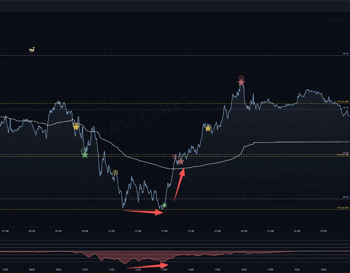
Negative value shrinking, in practice. Price grinds sideways along
its lows from 11:30 to 13:00 (lower arrow) while XJER's red area is already contracting
off its trough (same arrow below) — selling is running out, not accelerating. The push
off the low follows.
⚡ COMMON USE — DIVERGENCE
When XJER disagrees with price
A common way to read XJER is to watch for divergence between the
indicator and price, especially inside a sideways / range-bound market. When price
refuses to break in one direction while XJER's energy is quietly draining the other way,
the two disagree — the move that looks dominant may simply be running out of fuel.
That is a reading of the chart, not a forecast of a reversal.
In short: price shows where the market is — XJER shows whether that move still
looks funded. When the two disagree, the disagreement is the thing to notice.
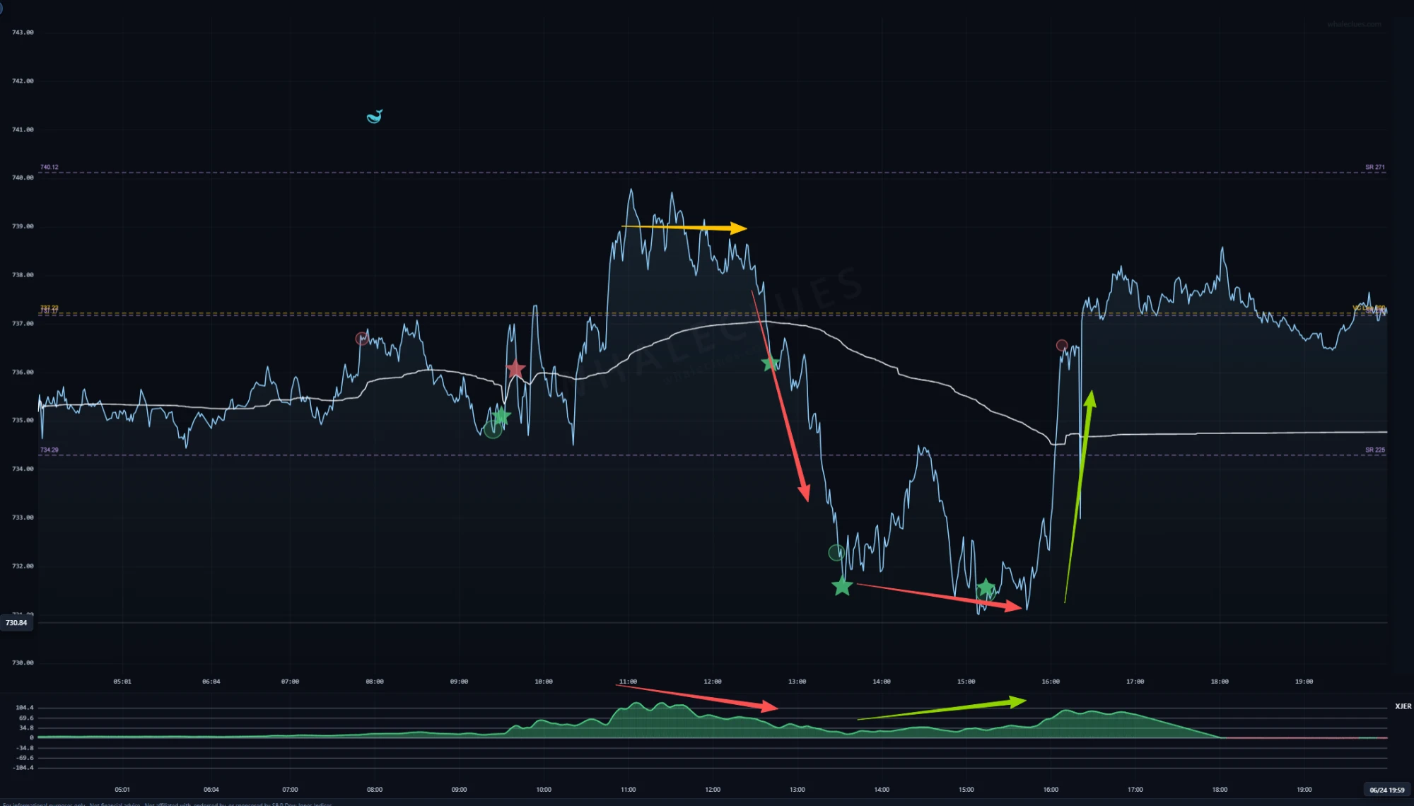
One session, both directions. First (yellow / red): price holds its
highs from 11:00 to 12:00 while XJER slides off its peak — the rally is no longer being
funded, and price gives up roughly six points into 13:30. Then (red / green):
price grinds to a new low through the afternoon while XJER turns and climbs — selling
is exhausted, and the 16:00 snap-back takes it all back. Neither move looked likely
from price alone.
Every level on this page is live right now.
Reading about a VC Line is one thing; watching price stall against today's is another.
The same markers, block prints and key levels described above are drawn on the live SPY, QQQ, IWM, DIA, GLD and SLV charts.