Key Levels — VWAP, VC Line & S/R
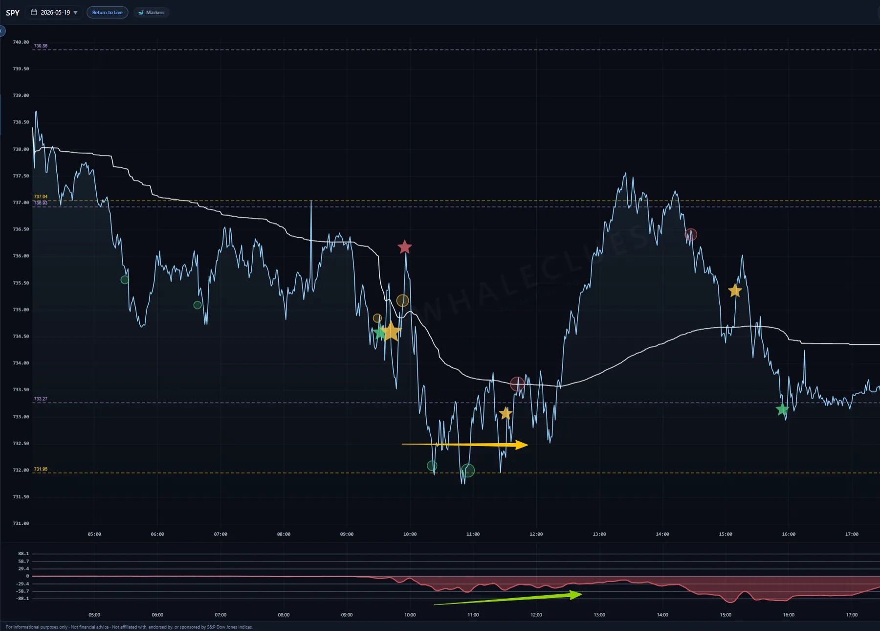
Alongside the live tape, WhaleClues draws the horizontal price levels a session keeps returning to — plotted right on the chart so you can see where size has clustered, and where friction has shown up before.
VWAP — the volume-weighted average price, the session's fair-value line. With price above it, buyers have paid up on average; below, sellers have. Price is often said to gravitate back toward VWAP; measured on SPY, that holds only when price is stretched far from it. How price reacts once it does reach VWAP — reclaiming it, or rejecting from it — hints at which side is in control.
VC Line (gold dashed) — a volume cluster line: a price level where a heavy cluster of trading has changed hands. These act as the market's memory — when price revisits one it often pauses or pivots there, so they behave as magnets and as support / resistance.
S/R lines (light purple dashed) — support and resistance levels where price has repeatedly stalled or turned. A thicker line means a stronger level, and only the levels the current view actually covers are drawn, so the chart stays clean until price approaches one.
Reading a level line. Each one is labelled at both ends — the level's price (rounded to the instrument's nearest tick) on the left, and its strength on the right. Strength is how heavily that price has been defended. VC Line strengths run into the millions, so they're scaled down proportionally (the strongest VC Line on the chart shows as roughly 200); S/R shows the raw score. A bigger number — and a thicker line — is a level that has mattered more.
Levels mark where size has clustered; markers mark when something printed there. On its own a level is just a line — but when a marker (Whale, Sun, Star, Circle) or an XJER divergence prints right at one of these levels, you can see the overlap. That overlap is context on the chart, not a call that the trend will continue or reverse — and not a decision point for a trade.
Going deeper: what the point of control is, and how often price actually returns to it, and does price snap back to VWAP?
Every level on this page is live right now.
Reading about a VC Line is one thing; watching price stall against today's is another. The same markers, block prints and key levels described above are drawn on the live SPY, QQQ, IWM, DIA, GLD and SLV charts.